|
|
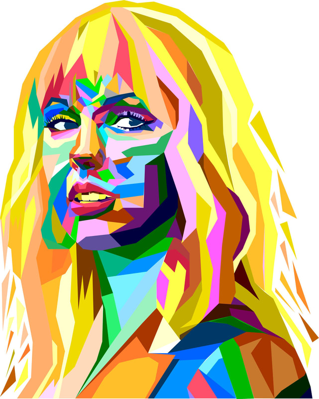
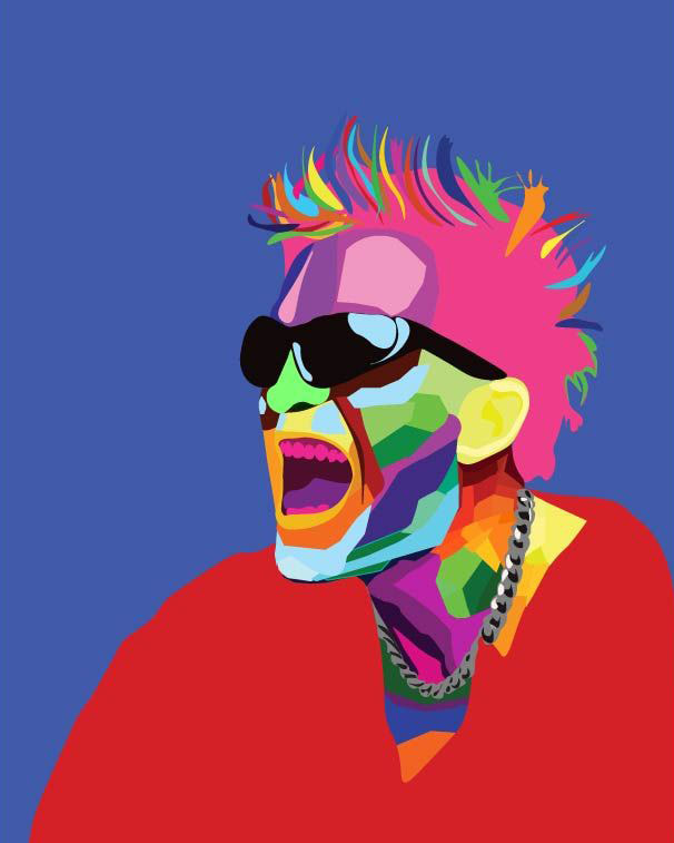
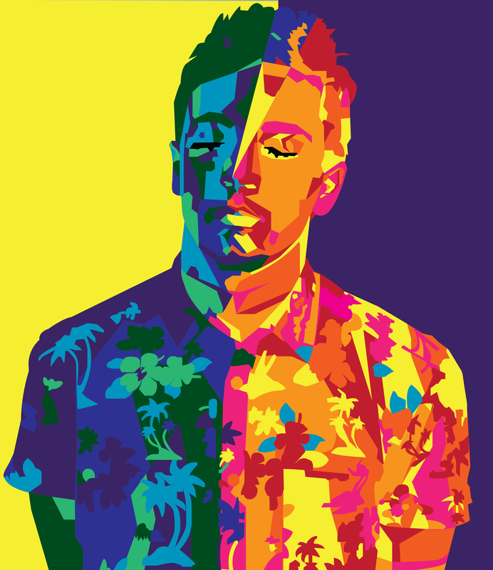
Your OBJECTIVE in this assignment is to Create a "head and shoulders" portrait using WPAP art style. This is a 2 part assignment that includes a (short 3 Paragraph) research paper.
Below your will find an amazing tutorial from:

|
Amazing artist and designer...Click on his name to go to his website and see all the stuff!
|
I have revised the instructions a bit from his website - there are many exciting products and tutorials on his site so definitely go check it out!
|
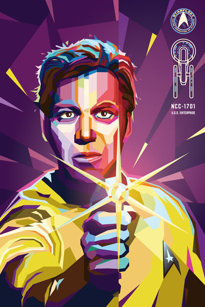
OVERVIEW
This tutorial will take you through creating a pop art portrait in Adobe Illustrator (in the WPAP style) using a few simple tools & techniques to make the process fast and painless. WPAP is a Cubist-inspired style of geometric pop art that has been lurking around the internet for quite a while. Popularized in the late 1990's by Indonesian artist Wedha Abdul Rasyid, Wedha's Pop Art Portraits or 'WPAP' for short, are easily recognizable by their sharp lines and wild, vibrant color schemes. |
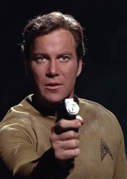
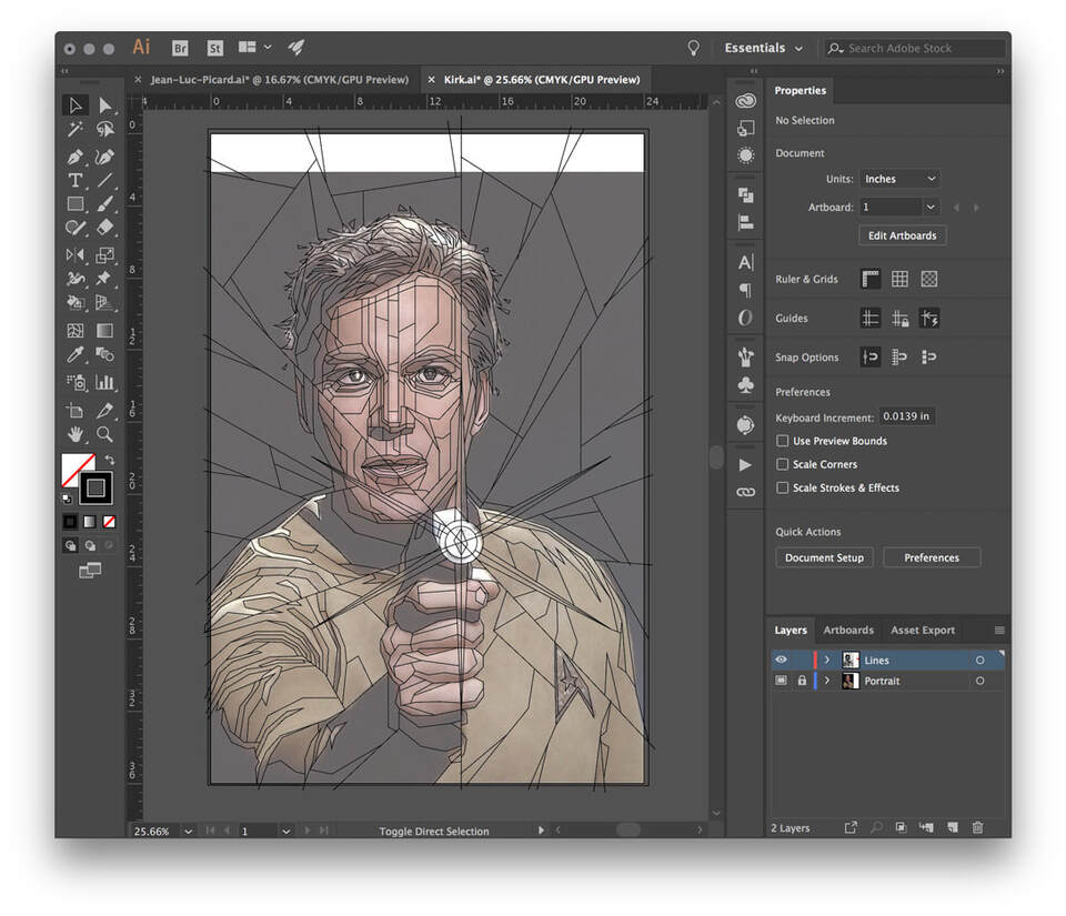
1. CHOOSE YOUR IMAGEThe photo you choose should ideally have well-defined tones and clarity. Typically the stronger the contrast the more dramatic the finished piece. Let's use Captain Kirk for our example.
|
|
2. SET UP YOUR DOCUMENT
|
Create a new Illustrator document with ART BOARD dimensions that suit your portrait.
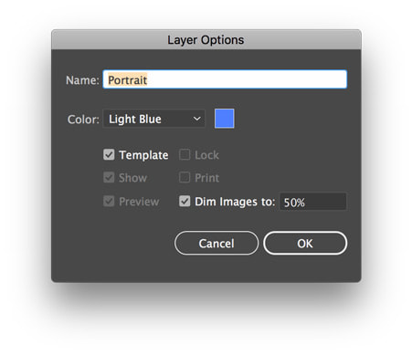
Place your photo into the FILE. Double click the layer and set it to a Template layer (the default Dim Images to 50% opacity is fine). Making this a template layer will be important later after you begin coloring, because it still allows you to see the photo when you use outline mode. Name the layer "Portrait" (always name your layers 😉). |
|
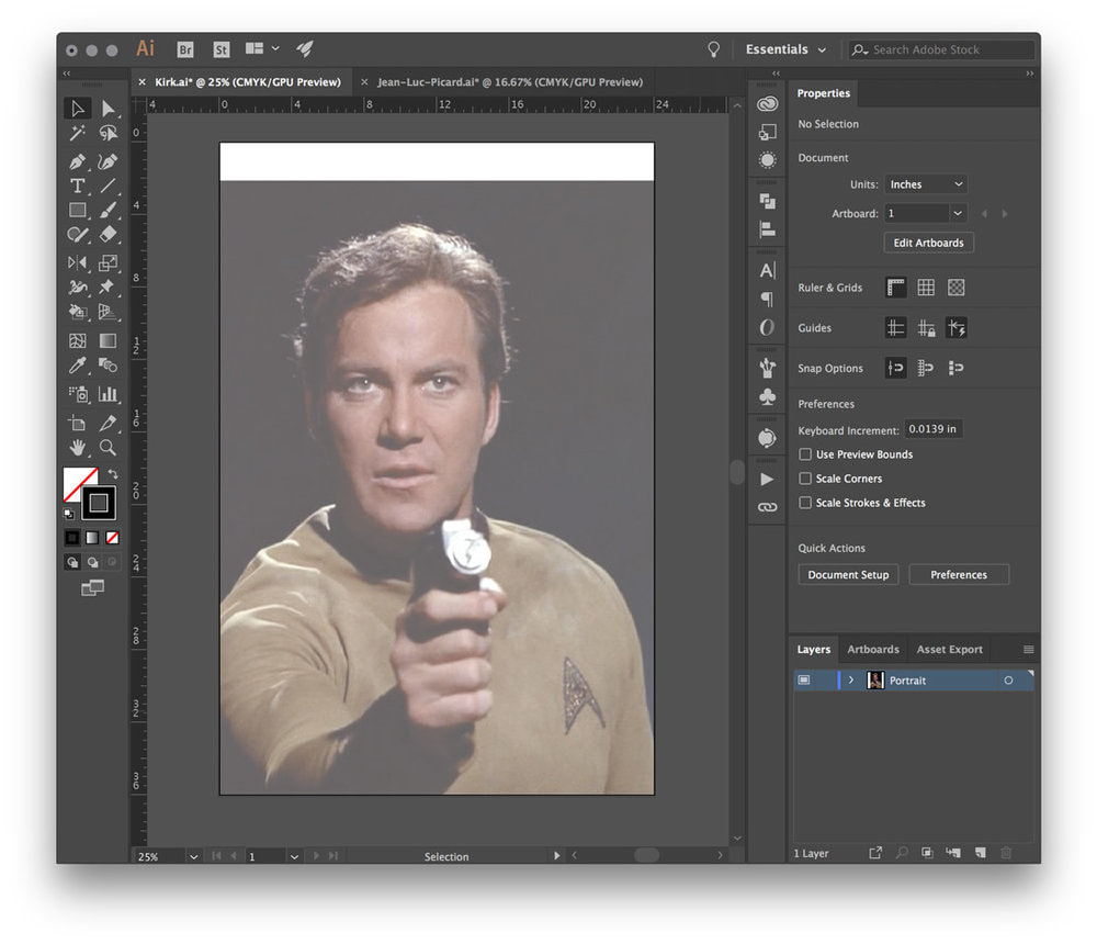
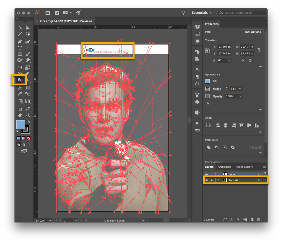
Newly PLACED reference image now named PORTRAIT - Lock this layer and create a NEW LAYER TO WORK ON!
3. MAKE A NEW LAYER
- Create a NEW LAYER on top of the Portrait Layer
- Draw a large empty rectangle with a 1pt border around the edges of the art board. This box will provide a handy border to contain the color regions once you begin.
- You could also turn Smart Guides on if they aren't already (Ctrl+U) to help with precision when placing lines in the next step.
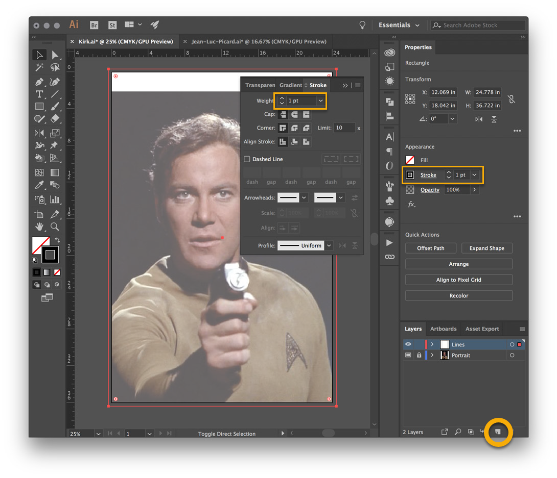
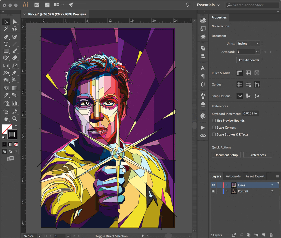
4. DRAW YOUR LINES
- Using the Pen Tool, create 1pt lines to define all the regions where there is a change in tone. There should be NO FILL!
- No need to worry about closed paths, shape layers, or overlapping objects — being messy is fine.
- Don't be afraid to create LONG LINES that cross the entire composition, and use more DETAILED LINES in areas such as the eyes, ears, and the mouth.
- Lines that reach the edge of the artboard should intersect or overlap the large rectangle border.
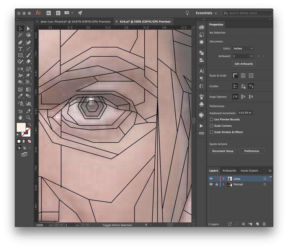
Eyes, ears, and usually lips will typically have more detail. The little light reflected in the eye is placed on a top layer at the very end (it's called a 'catchlight') and gives eyes a more lifelike appearance.
|
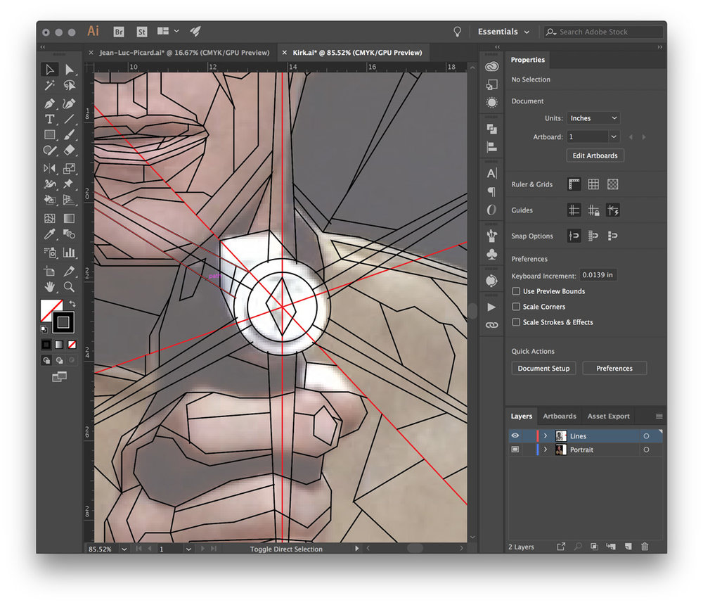
Notice how the phaser lines (shown in red) travel all the way to the edge, and the background has a fractured, shattered glass-like appearance. This should look great once we lay some colors down.
|
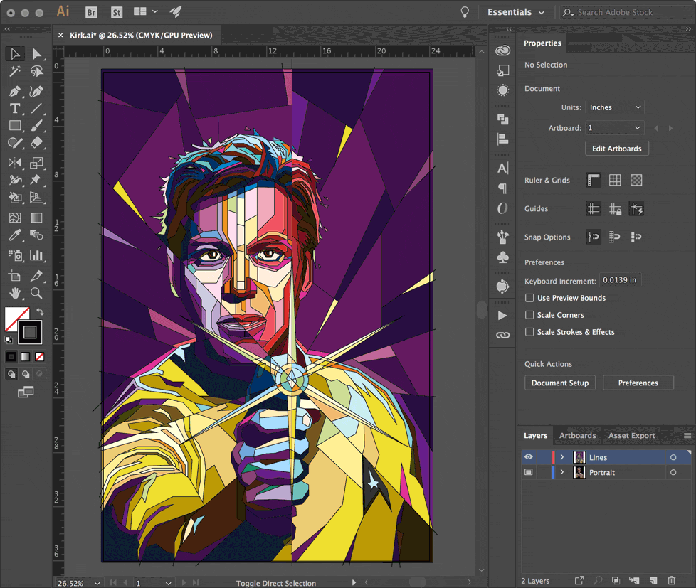
You may want add background elements that cut into the composition; leading lines, simple shapes, spirals, large letters, etc.
The additional lines and shapes will create an interesting foreground/background interaction. You can see how the rays of the phaser and the background create a burst pattern that cuts through the image.
You can always adjust your lines later to balance things out or add more detail, even after coloring. Having too many lines is better than not enough because the extra regions can be filled with the same color.
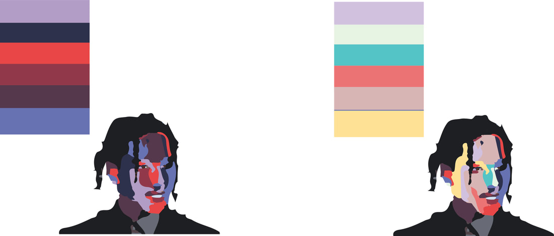
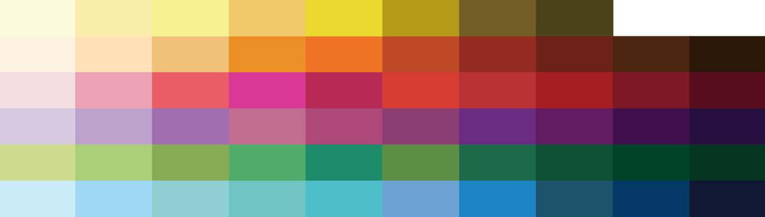
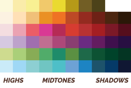
5. CREATE A COLOR PALETTE
All WPAP art shares a similar palette consisting of seven colors, each with about 10 tones. To begin, we'll create a ten-step grayscale palette. I will provide you with a pre-made color swatches, but remember, you can use your own colors!
- Create a VALUE SCALE for all the major colors: yellow, orange, red, purple, green, and blue. The first color in each set will always be a very light tint (almost white), and the last color in each set will always be a very dark shade (almost black).
|
WPAP SWATCHES
|
|
6. COLOR IN BETWEEN THE LINES
|
|
- SELECT all your lines, including the border rectangle
- Drag your SELELCTION TOOL or use CTRL+A
Once the live paint group has been created, mouse over everything and explore a little. You'll notice each region of your art will highlight when you mouse over it. The live paint bucket understands which areas can be filled based on your line work. Feel free to deselect everything (Ctrl+Shift+A), the art doesn't have to be 'selected' for the live paint bucket to work.
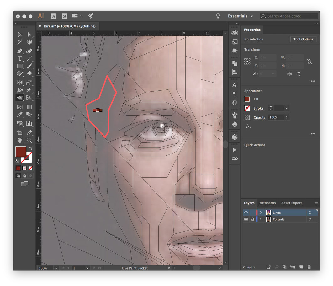
With the live paint bucket tool active, select a color from your palette using the arrow keys on your keyboard and then click the region you wish to fill. Because the color swatches are set up in a specific order, using the arrow keys to navigate the palette is very fast — it's easy to shift hues up or down and go lighter or darker.
|
|
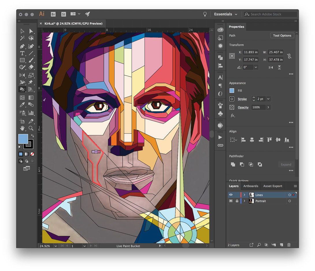
You'll be filling in each region with a similar tone from the swatches. Use the highlights and shadow areas from your source image to determine how light or dark your chosen color should be. It really doesn't matter which color you choose; as long as the overall tone is similar and the highlights and shadows are respected.
7. FINE TUNING
Once you've completed filling in the regions, take a peek at how everything looks without the outlines. Select the Live Paint Group and set the outline to nothing. YOU MAY WANT TO SAVE 2 DIFFERENT COPIES - ONE WITH THE STROKE OUTLINES and ONE WITHOUT.
WRAPPING UP
That's pretty much everything you need to complete your very own WPAP. With just a reference portrait and a bunch of lines, it's fast and painless to make your own pop art portrait.
|
|
|